Description:
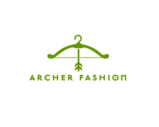
a logo idea i came up with while i was bored at a clothing store
As seen on:
N/A
Status:
Just for fun
Viewed:
5318
Tags:
hanger
•
fashion
•
green
•
bow and arrow
Share:
Lets Discuss
beautiful
ReplyHA! Nice. Not digging the overly stylized O and N in that typeface, as they detract too much from the real star of the show (i.e., the cleverness of the visual punchline), but otherwise, really awesome idea.
Replysee what you mean i like the o cause it all almost looks like a target, agreed that the n doesnt really fit ill see what i can do, thanks
ReplyPretty good. I'm not too keen on the arrow though.
Reply@Supermario, Yeah, I get your rationale about the O/target, but again, I think it's pushing things too far. All the cleverness and conceptualization is happening (and for this idea *should* be happening) in your icon, so the wordmark really should be taking a back seat.
ReplyNow, if your solution were purely typographic, then of course that O/target would make complete sense.
yes that makes sense i see what you mean by pushing too far, the concept along with the type is beating you over the head lol, thanks for your detailed critique. Ill see how i can modify the letters to fit better
ReplyVery cool idea of using it as a bow lol :D
ReplyPlease login/signup to make a comment, registration is easy