Description:
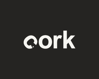
Logo for a champagne bar. Hence the negative space in the first character
As seen on:
Little Box Of Ideas
Status:
Nothing set
Viewed:
7570
Share:




Lets Discuss
The type with the C like that is kind of awkard, but I love the idea and I can clearly see the cork in the negative space. Have you tried any other versions of this concept?
ReplyHi ocular. Yeah i have some variants but so far this one looked most original and simple. I might work on it some more and post another version to see which works best.
ReplyBrilliant concept
ReplyAwesome idea, but something needs tweaking.
Replythank you guys. any ideas?
ReplyGreat idea. I wonder if this would read well, but what if you spelled it our vertically rather than horizontally and had the 'c' on its side 90 degrees*c*o*r*k*just a though
ReplyThat %5E is a good idea. **Perhaps use tightly kerned blocky uppercase letters for O, R and K to try and build a bottle shape ?
Replyi was considering that aswell epsilon, and ill give that vertical perspective also a try :) thanks for the quick respons
ReplyAlso, not sure about the trademark there, I'm reading too much into it
Replythis is realy nice. I like this version
Replywow
ReplyPlease login/signup to make a comment, registration is easy