Description:
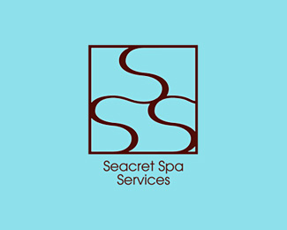
Although this business stands alone, it uses exclusively Seacret Spa products, so the logo and color scheme is inspired by the Seacret Spa brand. The logo needed to be earthy, soothing and luxurious. The client felt I nailed it. By request I updated the image to plain jane version.
Status:
Client work
Viewed:
5670
Share:


Lets Discuss
would you like some constructive critique?
ReplyI'm always up for constructive critique. Just so you know I was limited in what I could do with this. Oh, and the logo itself is just the three Ss in the square. The lines running out from there create a brocade pattern used in their advertising.
ReplyThe center is good. I see the waves SSS (spa) but the logo needs to have some ending. Ditch the bevel effect, work on better colors, the type is way too small in comparison to the mark or whatever you call that. Take the square area in the center and use that as your mark. have a balanced ratio of mark to type and I think this can be great. * *
ReplyThe actual logo does end. It is just the square with the SSS in it. I included the brocade pattern just to make it look different from everyone else's. And to give an idea of one of the brand's graphic elements. The colors, unfortunately don't translate here well. The color scheme comes from the iridescent sea foam blue paper we used for their spa menus and the brown is to indicate chocolate. The spa menus were made to look like boxes of chocolates. The name is too small beneath. It is bigger in their advertising. I made it small to fit in the brocade pattern shown here. The actual logo also does not have an emboss. It is flat 2D vector art. I added the emboss specifically for display here. Wish you could see an advertising piece. Sounds like you would really like it. Thank you for the critique!
ReplyHere you go. By request the plain jane version. Some people are just no fun. %3B) I work almost exclusively in print, so I don't get to use cool effects very often. I don't like to go too far and I do agree that some (ok, most) people here go way overboard. Most of my logos are on my website (yes, my website sucks) in their plain jane versions and usually link to their logo guides. The logo guide for this logo is not available yet because the client hasn't approved it. But it should be soon.
ReplyThank you for the float Martha!
ReplyThanks for the float Lecart!
ReplyPlease login/signup to make a comment, registration is easy