Rampant Eagles
by THEArtistT • Uploaded: Sep. 26 '08

Description:
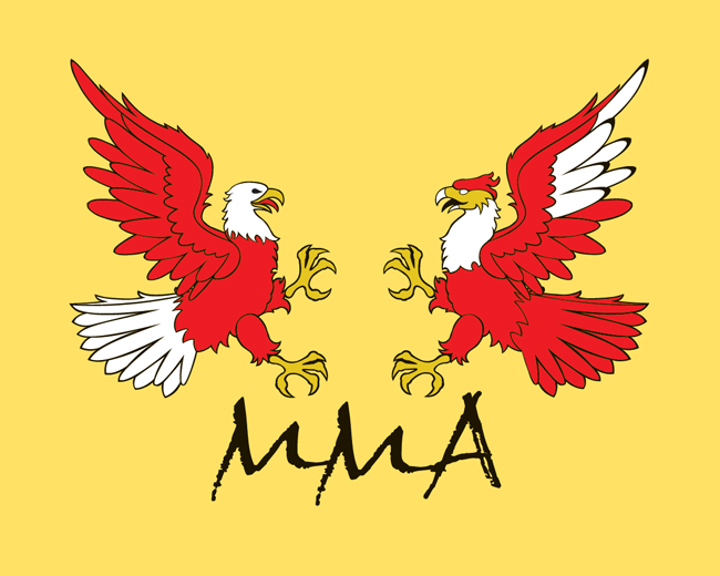
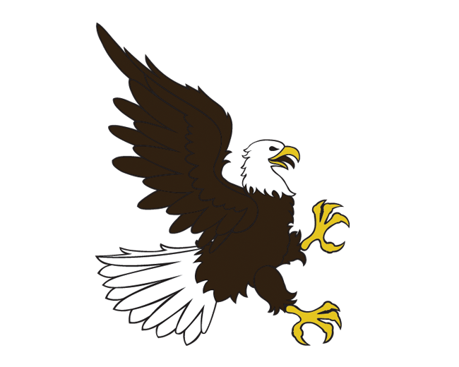
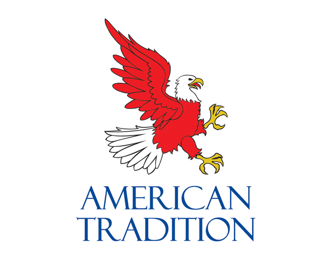
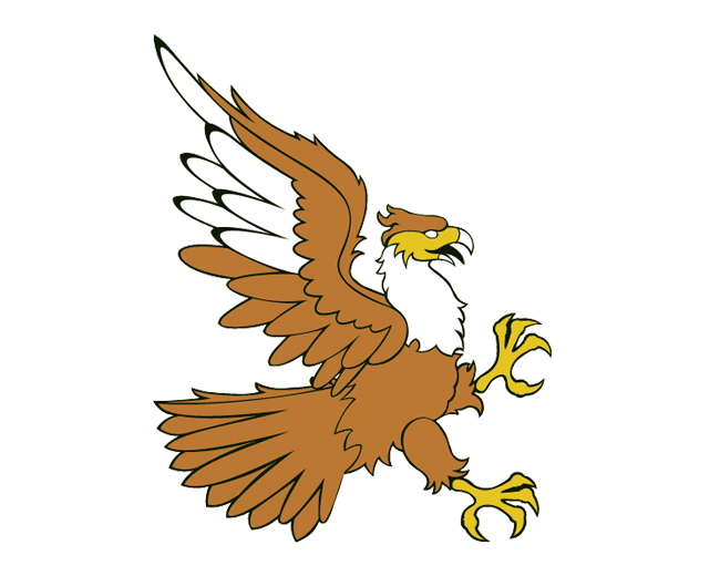
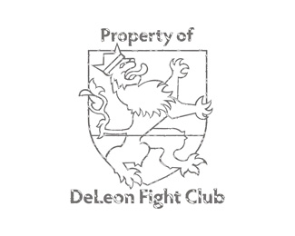
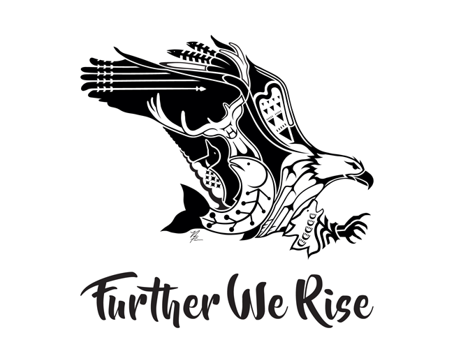
Concept originally for an MMA fight club in Houston. An American eagle facing a Mexican eagle. They decided to go with more traditional rampant lions instead to go with the owner's name of DeLeon. The American Eagle has been purchased. The Mexican Eagle is still available.
Status:
For sale
Viewed:
7,253
Tags:
illustration
•
history
•
patriotic
•
tradition
Share:




Lets Discuss
awesome mark
ReplyThank you. The client ended up going with facing rampant lions instead.
Replyi'd have to agree that this may be the best thing in your showcase!.. very nice!
ReplyThank you, too. I put a lot of work into this and it goes unused. There aren't a lot of rampant eagles out there, so I'm hoping to sell the clip art.
ReplyThanks for the float Myco.
ReplyTried to sell this on IncSpring.com and was rejected. Why do you think? Just curious.
Reply%5ELOL Jon.
ReplyI did email and they sent back a generic explanation that didn't say anything specific.
ReplyMaybe it's a little too detailed and more crest like? good and all and I like the fatc that you did not mirror the birds heads. to be honest there a re so many of the %22crest%22 logos out there. It's good and all but know what I mean.?
ReplyGood concept though with the American/Mexican thing.
ReplyI meant to develop the bodies to be more specific to the each bird species, but they went with the rampant lions idea first. The reason these birds were considered was because the fight club was owned by mexican-americans. I think incspring may have thought the sparing birds too american vs mexican. That's my hunch anyway. I spit the birds up and am giving it another try.
ReplyAnd thank you LogoMotive. Your critiques and praise are worth a lot.
ReplyWell they approved the bald eagles, but it does not look like the caracaras are going to be. If they aren't it will offend me a little. I personally think the caracaras are the better illustration. A lot more detail in the head. They are very beautiful falcons in real life. I'll upload it here if it doesn't make the grade.
ReplyWes contacted me. He probably had a little birdy in his ear? I was right in that the original design seemed more than a little USA vs Mexico. In the second round, only one got approved because having two uploaded logos looking so similar would be confusing. I should have thought of the solution myself. A blending of the old and the new versions in one upload. So there you go.
Replyveeeery nice
ReplyMan, I'm feeling the love today! Hope that means the whole day is going to go well. :) Thanks!
ReplyThanks for the float Leo. :)
ReplyThank you for the recent floats!
ReplyPlease login/signup to make a comment, registration is easy