Float
(Floaters:
3 )
Description:
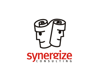
Logo for an HR company.
Status: proposal.
Status:
Nothing set
Viewed:
2549
Share:



Lets Discuss
This is cool. I really like what you did with the 'g'. Makes for a nice type solution. Kudos!!
Replyexcellent job..
ReplyA sound idea, particularly the S created by the figures. I'm not sure about the outline style and the faces could be improved.
ReplyThank you very much for appreciations!**I'm sure there is plenty of room for improvements ..., but since the client has left the combat area :( , I'm afraid this logo will remains as it is.**Thank you again, any comment are welcome!
ReplyLike Doc Oc said, great type solution. Nice work.
Replynice work, maybe, if you end the word consulting at the middle of the 'e' above it will look more equilibrate.
ReplyNice mark
ReplyI love this concept. I feel this design could be improved. It has the makings for an outstanding logo if more attention is put into the execution as mentioned above. The line weight is good but just a little too close together at curls IMO.
ReplyPlease login/signup to make a comment, registration is easy