Description:
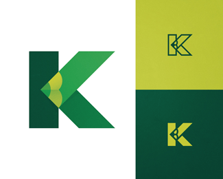
Simple and minimal yet conspicuous concept design for a letter K logomark. Will work perfectly both as a logo icon or just as an icon on its own. There are also two simple positive and negative versions for different usage options. Just pick up your color palette and add the mood that you like.
As seen on:
Tovarkovdesign
Status:
Unused proposal
Viewed:
4597
Tags:
letter k
•
character k
•
k logo
•
icon
Share:
Lets Discuss
???
Reply@Creativetrip what do you mean?
Reply@Creativetrip http://www.tovarkovdesign.com/kolore.html
ReplyPrzemyslaw @Creativetrip would you kindly explain the intent of your hit and run accusation before I contact the site admins?
Replythis get cleared up?
Reply@ClimaxDesigns Nah, the man is silent.
ReplyWhat's wrong with this logo? I've never seen a similar concept before. By the way, I prefer the positive and negative versions. :)
ReplyHi @ClimaxDesigns Well, I kindly waited, I messaged the guy via twitter, but he continues to ignore me. What should I do? Can you drop him a line (;
ReplyMeh, if its not serious enough for him to come back and sort it out then i see no problem
Reply@ClimaxDesigns Well, it's sort of a problem for me because it's a libel and a display of disrespect to a fellow member of the community. But ok, let it be so.
Replythe comments have been removed, i dont even know what was said, so there's nothing i can really do about it beyond what has already been done.
Reply@ClimaxDesigns the user @Creativetrip wrote that it wasn't my design and I must delete it with no links or any further explanation (: Let it be the person's measure of professionalism and maturity. Let it be (;
ReplyPlease login/signup to make a comment, registration is easy