Description:
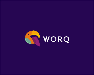
Logo proposal for a software development company from Brazil. Brand name is a fusion between 'work' and 'quality' and by the client's guide, the mark had to show the Q letter. I took an exotic bird as a symbol of agility (and Brazil) to help us pull the Q out.
Status:
Work in progress
Viewed:
14693
Share:


Lets Discuss
thiss looks great:)
ReplyNice colors, great :)
Replynice Q
ReplyLooking good! Nice Q, though at first sight it may appear as an O
ReplyThanks a lot fellaz, looking forward to a client's decision on it!
ReplyStunning work as always :)
Replybeautiful piece Alen. nailed it. IMO
ReplyAli, Tressley and Mike, thanks a lot!
ReplyAli, Tressley and Mike, thanks a lot! (someone is spamming my comments)
Reply:P
Replyi really love it!
ReplyReally nice!! Beautiful colors!!
ReplyGood job Mr Alen
ReplyThank you all guys! Alan, there might be some color adjustments though (I would leave them as they are), but this is the final logo option client decided to go with.
Reply%5ETrigger happy:-)
Replyohhh nice art work..
ReplyBrandsirrah, Rocky, Snd, Anie, thank you!
ReplyI dig the concept - perhaps make the %22Q%22 more fluent? The different pieces of the bird make it a bit distracting. Your colors are dead on though, very tropical.
ReplyNo one else sees the purple wing as a tongue?
ReplyGreat worq, Alen! lovely colors too :)
ReplyVery nice Alen.
ReplyLuminavine, yes and looks more like a tongue than a wing. IMO.
ReplyBreno and Matjak, thank you guys! Luma and Mike, final version can be seen here: http://logopond.com/gallery/detail/126362
ReplyBeautiful
ReplyThank you, Guadalupe!
ReplyPlease login/signup to make a comment, registration is easy