Description:
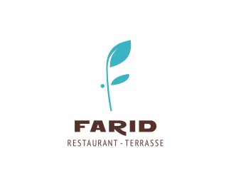
V2. WIP for a restaurant in Dakar, Senegal. Client asked for more simple and subtle solution. Mark shows a plant forming the F letter but also a stylized face (profile).
Status:
Client work
Viewed:
9100
Share:


Lets Discuss
Like it Alen. One thing, the tail on the %22R%22 just seems a tad thick to me. But then again, it may be just me.
ReplyLike everything here Alen*:)
ReplyThanks guys! Mike, I think you're right, I'll retouch that part a bit.
ReplyUpdated! Mike (when you wake up) let me know whutcha think! :)
ReplyI really like this one!
ReplyThanks Justin! This is the final choice by client, we are adjusting the type a bit though but this mark has a go!
ReplyWOW, ALEN, I JUST WOKE UP. (: the %22R%22 looks better to me. lookin' good.
ReplyLOL, no probs mate, thanks! I am afraid that it won't stay this way but thanks anyway!
ReplyI knew I should have never slept in. :)
ReplyAhahahaha! Tell me mate... how does sleeping feel.... can't remember at all.... :)
ReplyCompletely missed this, nice work here.
ReplyThanks Sean :) Stay tuned for the update.
ReplyLove this one Alen!
ReplyReally nice and clean bro:)
ReplyAli and Fabster, thank you my friends!
ReplyNice, clean design.
ReplyPlease login/signup to make a comment, registration is easy