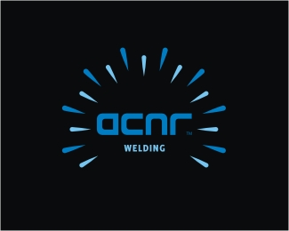
Float
(Floaters:
7 )
Description:
Logo proposal for a welding company from Sydney, Australia.
Status:
Unused proposal
Viewed:
4269
Share:
Lets Discuss
Stop stealing my Aussie clients bro lol...killer job brother
ReplyHahaaa, sorry Fabster! How about 10%25? :) I'll send you few of my Croatian clients, fair enough? %3B)
ReplyOhohooo, grabs me a lot. Very nice.
ReplyThanks a lot, Jan! It is pretty obvious that it shows welding process effect, right? Type custom made...
ReplyType08, I think yes it is obvious. I think this would works well in welding branch. Blue colors this helps, too to associate with welding. Orange and red would this communicate more to fireworks ... I think second title %22WELDING%22 is on the right place, too. Custom type is technical and modern, works too.
ReplyYeah, I developed one more logo for sub branding purposes of their 'Home Improvement' services. It is the same logo but in green colors and it works nice as well (the idea was 'sunrise' element with 'eco' touch). Will post it here soon, thanks again Jan for your comments. :)
ReplyThis is nice.. I almost think it'd be more successful without the burst.. just a simple type treatment.. anyways, kudos
ReplyThanks, Danny G! It's still WIP so it's a possible option, definitely... :)
ReplySuperb job! agree with %3Cb%3Edannygdammit%3C/b%3E type treatment.
ReplyThanks Oski!
ReplyPlease login/signup to make a comment, registration is easy