Description:
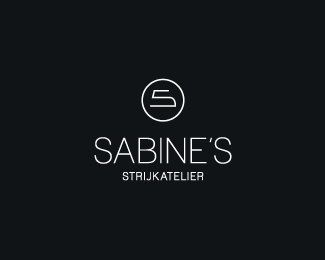
A logo for a client who has a small ironing service. You should recognise an iron and an 'S'... She asked to make it look as classy as possible, with the principle of less is more in mind.
Status:
Nothing set
Viewed:
4937
Share:
Lets Discuss
Love this, Tomme! Well done! Saw it all even without the description, very clear, very direct, minimalistic, marvelous!
Replyi was almost going to miss this one, but gladly i saw it. very nice work tomme! though i would do something with the smaller text that looks crispy.
ReplyWell, how could I possibly not like this idea?
Replythanks for the comments guys :) the small text will get fixed soon
ReplyI don't think it would have taken a lot to mention where the inspiration came from.
Replythats right barry, almost forgot to thank you :) tbh i didn't quite understand your hint the first time, but it came to me a bit later :p so thanks again mate
ReplyYou%B4re welcome.
ReplyPlease login/signup to make a comment, registration is easy