

Description:
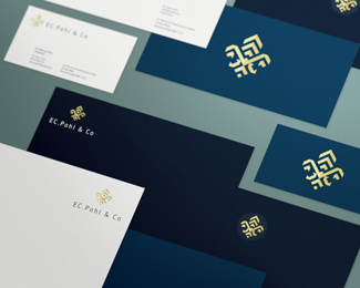
Logo for a private equity firm. The mark is a stylised version of a Fleur de Lis, requested by the client as it's part of their family crest. You can check out the presentation on the behance link below.
As seen on:
BEHANCE
Status:
Client work
Viewed:
9579
Tags:
flower
•
emblem
•
Fleur de Lis
•
design agency
Share:



Lets Discuss
and one big float from me ... no, no ... stop ... have to press the fav button too ... why??? what a question ... because ... this one is rad ... !
ReplyAnother great work Matt. Typeface selection is a bit unexpected, but together they looks great!
ReplyWay to go maestro!
Replyhaha! @Bernd, you da man. thanks for the words and support. @deividas thank you my friend - yes, i'm really happy with the way it came together. @alen. cheers champion!
Replythanks also logopond for the gallery inclusion. quick question though... i've had problems uploading complimentary images - it keeps saying wrong file type.
Complimentary images now uploaded. Not sure why it wasn't working before but all sweet now.
ReplyPlease login/signup to make a comment, registration is easy