Description:
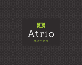
This is the final logo for my Atrio project. Atrio means Atrium in spanish.
The client wanted a mark that supports the concept of the building and name, for example the Atrium is the heart of the building but is not apparent from the outside, a surprise package that has a light and brightness to its centre or core.
The pattern was created from elements of the mark. This will be converted to a metal cut-out on sliding privacy doors and stainless steel foyer feature walls.
This is also a custom typeface that I'm in the process of making a functional font.
Status:
Client work
Viewed:
6579
Tags:
•
atrium
•
font
•
custom type
Share:

Lets Discuss
This turned out great, I get the concept straight away & that pattern really makes the whole thing pop.
ReplyCheers Josh! I received the brochures the other day which turned out great. Stoked with the way the whole thing came together.
ReplyLove the colors.
ReplyThis is looking very posh Verg! That BG is amazing mate.
ReplyCheers Norman. Stoked you like buddy. The development is taking place in your neck of the woods, so you\'ll probably see a big kick arse banner with the brand whilst it\'s being constructed.
ReplyThanks also cnasshan
Hi Matt:)Like said before, it looks awesome!:)
Replythat something in it is interesting work perfectly!
ReplyC8, Yuro... Thanks a million. Really value your comments.
ReplyPlease login/signup to make a comment, registration is easy