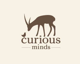
Description:
The logo is for a children's psychology center that works with 5-10 year-olds to cultivate their natural creativity.
Status:
Client work
Viewed:
12895
Tags:
mind
•
chick
•
deer
•
creativity
Share:
Lets Discuss
Sweet. Give us a B/W version!
ReplyB&W - check :) Now the more I look at it, I'm not sure the chick's feet are ok. Perhaps a bit too short.
ReplyCool concept. I think you could simplify both animals though, especially the bird.
ReplyGreat concept! I totally agreed with Sam.
ReplyThanks for the input guys. I think it's much better now :)
ReplyYeah much better (but if you asked children, I'm sure, they would tell you the opposite)! The bird is sitting on the type, why isn't Bambi standing on it? (just a proposal) :)
ReplyHem.. I see now, its not Bambi... it got some horns. :D
ReplyYep, Bambi is more of a deer, while this is an antelope.
ReplyThe thing is even though the center is for kids, it's actually the parents who are the target. So it has to be something in the middle, appealing to both kids and adults.
Lovely idea and well rationalised ^
Reply^ I agree! It works well.
ReplyOne suggestion. Maybe ever so slightly rotate the bird's body anti-clockwise so that it looks more curious about the antelope too which might make it look less static. Either way, I love this, and I keep coming back to look at it :)
ReplyGood subtle suggestion.
ReplyAnd easier to do than the Antelope :)
Replyamazing concept here.
Replyit's bloody perfect.
ReplyBird is now curious too 10x to Gareth :)
ReplyAnd the client seems to be leaning towards this as a final, so I really appreciate all your help!
@Mike: I wish all clients asked for such subtle and easy alterations instead of changing concept direction all the time :)
Well done, cool concept.
ReplyI don't want to be the bad boy here and the gallery entry (congrats!) implies, that I am wrong, but I think, that it still can be better. I don't understand - for example, why the antelope is floating, while the bird is not. I tried to see, if there is some perspectives, which may lead to a raised position of the antelope, but there is no.
ReplyI can imagine well, how the legs of the antelope would emerge from the word 'curious', maybe on the empty letters a bit of grass etc. Something, that lets the whole composition melt together.
Anyway... my daughter (6) said, its sooooo sweet. :)
I actually tried that out when you suggested it, but it looked kind of busy, so I left it the way it is. The more clear space, the better, IMO :)
ReplyAlright... thanks for the answer! :)
ReplyI think it's fine. I just imagine or see the Antelope/Gazelle standing back a bit deeper almost as if your looking at it from a worms eye view.
Replyagree with Mike. the gazelle gives the logo a little depth by not touching the text.
Replyclever
Replygreat balance in this one! very nice
ReplyThat's how I saw it too, Mike. It's cool too how the dot on the i kind of looks like a pebble or a rock. Just adds to the scenery. Nice job with this!
Replygreat illu! :)
ReplyGreat thought
ReplyEndearing, simple and beautiful. Great job!
ReplyI love this, so cute and one of those unforgettable marks :)
ReplyWhen a logo puts a smirk on my face, it means you have struck a chord, at least with me. Well done with this logo.
Replylove your logo styles and typo!
ReplyPlease login/signup to make a comment, registration is easy