
Float
(Floaters:
0 )
Description:
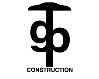
g b construction is my first contribution to logopond. This is a class assignment.
Status:
Student work
Viewed:
840
Share:
Lets Discuss
This gives great direction as to what your logo is for. Meaning that you do construction. However, the umbrella/ruler has me a bit confused. I am not sure what it means or refers to. The actual graphics are balanced and clean.
Replyunfortunately that is how most T-squares look. I could have gone for a straight T, but I like the way an actual T square looks.
Replyhey I was thinking mane you should try some color on the letters or on the square. it would make it stand out more and may be fun to play with. I was also thinking that the word constructions should not touch the square but be apart from it. maybe you should put marks on the square so people can identify it better. Like your font.
ReplyI do like the simplicity of this logo but now that it's designed in black and white you should play with color. I am having a little bit of a disconnect with the %22T%22 it looks like your trying to say G.T.B. Construction. I would recommend moving the bottom of the %22T%22 up and move the word Construction up but make it further away from the bottom.
ReplyWhat if the %22g%22 and the %22b%22 shared the same upright and the t-square came out from that upright. Plus maybe adding simple bolt holes where the two parts of the t-square would overlap. Shorten the bottom of the t-square and bring construction up a little closer, but not touching.
ReplyI really like the suggestions for making this logo better, the bolt holes and shared g %26 b sound great. I also agree that the construction should not be touching. All the comments help me a lot. Thank you.
ReplyPlease login/signup to make a comment, registration is easy