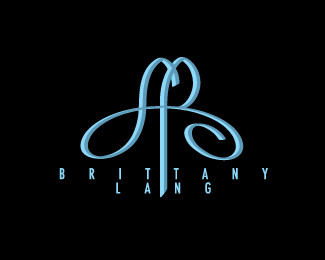
Description:
Brittany is an LPGA tour pro. I met with Brittany on Monday and we discussed a logo for her. She signed her name in my journal and the way she writes Lang is similar to the "L" shape in this logo. I stylized the shape considerably. The two shapes combined suggests a B and an L in addition to the signature. I would appreciate comments as I want to deliver a good logo for her.
Status:
Nothing set
Viewed:
1601
Share:




Lets Discuss
I keep seeing the L before the B which confuses me and the spacing between the letters of looks odd, it doesn't seem to be consistent, the LANG take up more space than the ITTA in Brittany.**I like the flow you've worked into the mark though, it's almost ribbon like..
ReplyPlease login/signup to make a comment, registration is easy