Description:
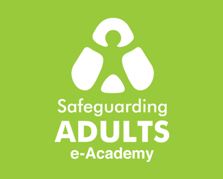
A logo for the up-and-coming Safeguarding Adults e-Academy. An organisation that delivers e-learning materials to health and social care workers.
Status:
Client work
Viewed:
1582
Share:

Lets Discuss
I think that is a very interesting mark. Can you explore the addition of more colours?
ReplyThanks Raja. My initial idea was that each of the 4 shapes that makes up the person would be a different colour (suggesting different aspects of safeguard coming together) but in the end we went for a solid white that punches through the green.
ReplyI think its a very good mark. As Raja said.. colors would be interesting to explore. BTW.. I made a similar design long ago... not exactly the same but just letting you know for design evolution purpose :)%0D*http://brandstack.com/logo-design/details/7297
ReplyHi Noetic, yes those logos are very similar indeed! Seems like we had the same idea about using the negative space to hint out a little guy.
ReplyPlease login/signup to make a comment, registration is easy