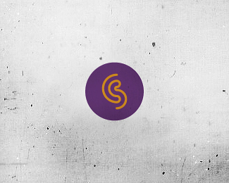
Description:
another CS concept
As seen on:
www.wizemark.com
Status:
Work in progress
Viewed:
3675
Share:



Lets Discuss
I like the direction Srdjan. I think you can extend the top part of the 'C' a little more, as well as the bottom part of the 'S'. Will give it a more %22complete%22 feel that way IMO, and possible make it a little more legible.
ReplyThanks, Joe. See this http://www.screencast.com/t/KT0IZgFv8bZ8 To me, left one (displayed here) has a better balance and somehow more motion feel to it..
ReplyI like the thicker lines here, but I agree about extending the top and bottom lines a bit. I think it kind of leans left right now.
ReplyThanks, man. It does feel like it%60s leaning left hence the motion feel, at least that%60s how i see it.. dunno.. gotta sleep on it, it%60s still wip..
ReplyPlease login/signup to make a comment, registration is easy