Description:
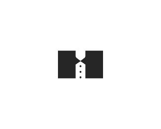
2nd concept - `H`, tuxedo, hotel, 2 talk boxes. This is more suitable cuz integration of the symbol has been requested. version 1
Status:
Unused proposal
Viewed:
1921
Share:


Lets Discuss
I also see some kind of man in bow tie with buttons on shirt.
Replyfirst thought is that, I only see the tuxedo references (before i read description). I'd think of this as a tuxedo/tailoring service and wouldnt second guess that this is a community for people to share,shop and talk... the other version seems %22friendlier%22 and more about conversation imo. **Regardless of what company it's for, it's a nice mark.
Replyaaaah now I know what tuxedo is, sorry ! %3Bp
ReplyI kind of like this and it has a great potential... 2 ideas - try to separate the tie from the tuxedo (both elements will be more readable and H will still be legible) and try to round the outer corners of the tuxedo (left one on the left element and right one on the right element) to slightly get something like the U or crest form...
Reply@Milosz lol! :p*@Katharine Thanks. You know those logos where speech bubbles just jump in your face? Well, i don%60t want that to be case here. 2 of those talk boxes are there in the mix, but kinda subtle. With colors it%60ll pop even more.*@Alen Thanks, man. I hear what you saying, but with splitting those two i%60ll loose talk boxes. As Katharine mentioned, they%60re already in the 2nd plan. However, I agree re your 2nd idea. Something along those lines would be a nice touch def. *
ReplyPlease login/signup to make a comment, registration is easy