Float
(Floaters:
8 )
Description:
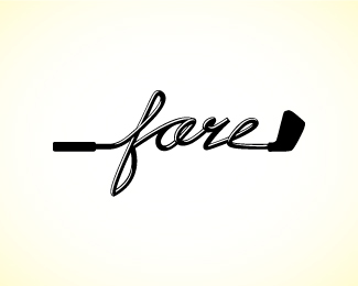
Logo for youth inspired urban golf apparel
Status:
Nothing set
Viewed:
1995
Share:
Lets Discuss
Very interesting idea and well done.
ReplyVery nice indeed. It reads %22fare%22 though.
ReplyLOl,.. that's about how my clubs look. nice idea.
Reply%5E%5Eagree with Art Machine, cool idea, but i read %22fare%22
ReplyI love when type and mark are seamlessly intergrated. Nice style.
Replynice. btw, i also initially read %22fare%22.
Replyit seems that some people read it %22fare%22, i think i'll fix it, and post it here later.**thanks for the comment guys. :)
ReplyPlease login/signup to make a comment, registration is easy