Description:
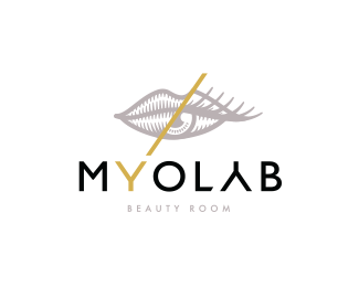
beauty room logo
Status:
Unused proposal
Viewed:
5268
Tags:
beauty
•
lips
•
eye
Share:
Lets Discuss
Very unique!
ReplyNot sure about the A, but everything else is tops!!!!
ReplyMindbending
ReplyThanks Hayes Image, you're 100% right.
ReplyI agree with Josh. It almost doesn't read as an A because we aren't used to seeing A's like that. I like the idea of it being an upside down Y, but I'd try just doing a regular A, possibly without the crossbar. But besides that, I love the mark and it's connection to the type. Really interesting.
ReplyI'm with Josh and Sam, that upside-down-Y-as-an-A just doesn't work. Everything else is so perfect, but that just pushes it too far.
ReplyAnd by "so perfect," I mean, this is easily one of the coolest logos I've seen in a while. I love that perfect blending of iconography, and the split emanating from the Y is a nice touch.
Too bad the client didn't go for it.
ReplyPlease login/signup to make a comment, registration is easy