Description:
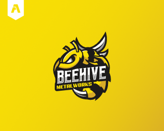
Beehive Metalworks are an American metal fabrication company that work on a range of metal based projects. The criteria asked for a logo that was 'bad-ass' and masculine. Being a well established company, they wanted a logo that would modernise their brand.
Following the criteria, the finished logo utilises heavy line work and sharp edges for that 'bad-ass' look. The wings and stinger of the bee represent the metal side of the logo. My illustrative style complemented the masculine aspect of the logo quite well.
As seen on:
DeviantArt
Status:
Client work
Viewed:
3673
Tags:
wasp mascot
•
bee mascot
•
wasp
•
bees
Share:
Lets Discuss
Marvelous design !
ReplyPlease login/signup to make a comment, registration is easy