Description:
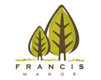
logo design for francis manor, an exquisite three story condominium residence, located in downtown, LA
---the theme is nature and forest
Status:
Nothing set
Viewed:
7076
Share:


Lets Discuss
perhaps a bit trendy, but the mark is well executed.**I'm not sold on the type though. Maybe drop the copperplate and go with a more modern sans. Also, I don't think the letterspacing is helping and would work just fine without it.
ReplyThe branches in the trees make me think there are possibilities to maybe make them into represenations of the %22three-story condos%22 or the people living in the condos.%0D*%0D*Maybe the trees are designed with a perspective of the viewer looking up at them - similiar to a three story building?%0D*%0D*My point being, the base elements seem to be here. Now you need to tweak them to give it the unique feel that says %22francis manor.%22
ReplyI agree with Darrel about the type. Drop the copperplate! Also, the mark is a bit overpowering. Try reducing its size and maybe use lighter colors. All in all, nice job.
Replyagreed on type but loving the mark ...
Replyhey guys, thanx for the comments!guess i need to play around with the type
Replylove the trees%7E!
ReplyTake away one of the trees
ReplyPlease login/signup to make a comment, registration is easy