Float
(Floaters:
0 )
Description:
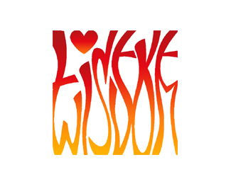
Logo for a wedding invitation. Couple wanted symbol of fire.
Status:
Nothing set
Viewed:
1598
Share:


Lets Discuss
Wow, really hard to read.
ReplyYa that's true but the main purpose was to have an eye catcher on the front of the invitation...like a logoptic
Replyillegible............sorry, fair enough having an eye catcher but even when I know what it is meant to say, its still difficult to make out!
ReplyPlease login/signup to make a comment, registration is easy