Description:
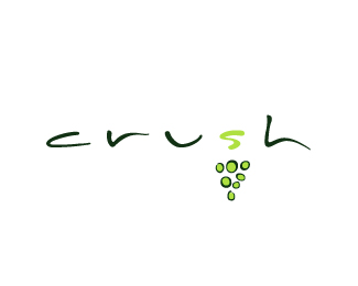
The organic letterforms and use of space portrays the wine region terrain. A mark designed to represent the sophistication of wine drinking culture.
Status:
Nothing set
Viewed:
1063
Share:

Lets Discuss
Very nice. Color would be my only question.
ReplyI agree, very nice work. Personally, I would tighten the kerning up a bit, even though you feel that the amount of space is integral to the overall design. I think the organic nature of the letters as well as their extended design characteristics is enough to pull through the feeling of the wine region without having so much air between them.
ReplyThanks for your feedback. I've brightened up the green and tweaked the spacing as much as I dare, as this job is completed. That being said all logos can be improved!
Replymy outlook as well. :) this is very nice.
ReplyPlease login/signup to make a comment, registration is easy