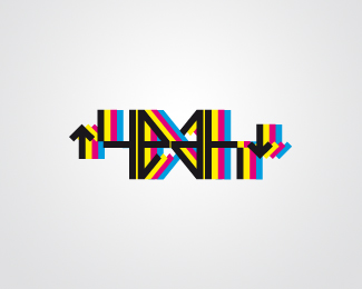
Float
(Floaters:
6 )
Description:
experimental
personal logo.
If it is rotated of 180° it keeps the same legibility.
Status:
Nothing set
Viewed:
2846
Share:


Lets Discuss
to hard to read. I see the %22e, a %26 h%22, but no %22y%22. sorry.
ReplyIt's probably easier to read if you drop the extra colors.
ReplyI can't read it but I like it :)
ReplyPlease login/signup to make a comment, registration is easy