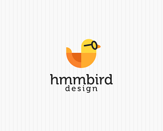
Description:
Second proposal for Hmmbird (a small design agency). The mark on this one is created using basic shapes. Type fits the titles in the already existing website. (WIP)
Status:
Unused proposal
Viewed:
6973
Share:
Lets Discuss
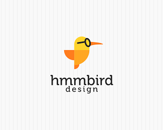
I think this little bird pulls off the glasses better!
Replyeah!
ReplyHaha. I don't think I've ever seen a bird wearing glasses, cartoon or otherwise. I prefer this version. :-)
ReplyThough I guess technically this looks like a duck and not a hummingbird. I still like the design of it more.
Reply%5Eguys, I will probably change the beak so it's longer and sharper so it will look more like a hummingbird. still I have to wait for client's feedback first.
Replyno prob david. understandable!
Replyhaha, nice :D
Replyi think it would look nicer without the lines. great logo btw.
ReplyPlease login/signup to make a comment, registration is easy