Description:
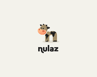
Nulaz is a dutch service that give people information (via mail/sms) of new events to come. The client wanted a cow as a mascot. The body is an "n" and the spots on its body are the world's continents (this was a client request!). Customised type.
Status:
Client work
Viewed:
12251
Share:
Lets Discuss
Good stuff Andreiu.
Replyyou're very fast rudy! thanks! :)
Replyi like it %3B)*
ReplySouth America %26 Africa, holy cow (:
Replyyeah, It's so nice*)
Replyworks for me and I'm sure it will for the client. Cute and meaningful.
Replymuuuuu:))
Replynuuuuu:))
Replydang. this cows always work! :D
ReplyNow that's a cool cow!
ReplyNicely executed Andrei (say hello to Pablo) but let's not forget one of the best logos on the Pond, Sean's (Fogra) masterpiece: http://logopond.com/gallery/detail/28465
Replythanks Alen for the remark! and yes, i know about that one. but as i said before, it was the client's request, so i couldn't back off. :)
ReplyYou did your job mate, and you did it good!
Replythanks for the support again, Alen!
ReplyI like this, andreiu. And thanks, Alen but it seems that my idea wasn't that original when I created it.
Reply@Fogra: The puns in the comments were original though. %3B)
Reply%5E Ha! That's the main reason why i didn't delete it!
Replyhahaha :))%0D*@fogra: congrats for your logo again. originally this cow had some oval spots on it. i personally liked it more without the map. buuuut..
Reply...it's a coworld out there...
ReplyI'm sitting here in cold,damp Amsterdam and this has made my day. Its so warm and inviting...LOVE IT!
ReplySpeechless. Hopefully the client enjoys it as much as we all do.
ReplyIt's very mooooooving.
Replythanks for your support and kind thoughts to all of you guys!
Replylovely! :)
ReplyLove it!
Replynot sure i understood everything you said, david.
ReplyVery nice mate, very very cute!
ReplyNot sure about the type dude, but the illustrative mark is fantastic.
Reply@mabu: had some variations on the font, but this is the final version that was already accepted by the client. and i think it works for me. thanks!
ReplyHi, we are enjoying the logo a lot. You can see how we are using it for now here: http://www.nowntown.com/ **We decided not to use the new design for Nulaz, but launch a brand new service in stead! (Of course the name had to start with an 'n' as well).
Replyfunny and clever at the same time :)
Replysupermegacool! :O
ReplyCan't believe I missed this one. Cool Cow
ReplyNice N too
Replythanks a bunch guys!%0D*@cerise: great to hear that from you! :)
Reply)
ReplyNice work, very dynamic
Replymi-mi-mi!
ReplyPlease login/signup to make a comment, registration is easy