Description:
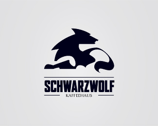
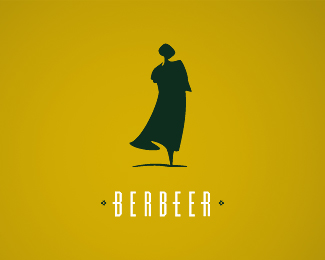
logo idea for a coffee-house. for fun
Status:
Nothing set
Viewed:
7337
Tags:
molnar
•
peter
•
schwarz
•
black
Share:
Lets Discuss
nice !!!
Replythanks folks, i glad you like it :)
Replygood line..
Replythank you olalb, I appreciate :)
ReplyLooks like a wolf on a motorcycle.
ReplyI like the use of negative space that gives the wolf the appearance of crossing its paws.
Replycoffee house? what kinda coffee they server there or are all the patrons werewolves :D
ReplyI love a good use of negative space, but I have to be honest, this one threw me off. WAY OFF.
ReplyThe particular way this one is rendered made me think it was a wolf on his knees... umm... humping... someone or some*thing*.
Then it looked maybe like a wolf on a motorcycle.
I really had to study this one hard to determine that the negative space elements were a) the wolf's right front leg/paw crossed over top of the left, and b) the wolf's left hind leg.
I think you might want to try reworking this one just a tad so that the ambiguity is diminished. Generally, I like where it's headed, but I think it may be too confusing for most people.
Either that or I'm just dim (not entirely out of the question).
^ if you hadn't described it, I would never have seen it. it is too clever for its own good. such designs may delight a few, but the don't work for the many which is what good design is supposed to do. I love the illustration, but unless people can SEE it, it is useless. try adding a color for the fore and back legs?
Replyswdwereedds
ReplyPlease login/signup to make a comment, registration is easy