Float
(Floaters:
72 )
Description:
Personal project. Possibly portfolio showcase, not sure yet.
Status:
Just for fun
Viewed:
19075
Share:





Lets Discuss
Nicely executed.*
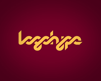
ReplyLooks great. has a really nice flow to it. Could the h be brought into the mix though?
ReplyInteresting.
ReplyNice job, arpad :)
ReplyRichard, thanks for your comment, in fact, I thought of it but I wanted the %22logo%22 part to be more readable so I went for the safe trip. eh.
ReplyI like the first half a lot better than the second. It feels somewhat disconnected, specifically at the 'h'.
ReplyHey Joao, good to see you on here!
Replyit has been a while arpad! Good stuff
ReplyVery nice. Easily read. I think that %22y%22 could ligature to the %22p%22 like the %22go%22.
ReplyThe only thing that doesn't look perfect to me is the %22e%22. This reminds me of %22los logos%22 in a good way, meaning this could work great as a logo book.
Replyoulala... hot stuff! Love it!
ReplyIncredible! great work.
Replylove this style!
ReplyGreat style! I like it.
ReplyLooks nice. In regards to Lecart's comment, could that negative space going into the eye of the 'e' be rounded off like it is on the 'g'?
ReplyReally nicely done.
ReplyAt the first look I stared at it and tried to understand what the words are. If you look for the first time at it you cant distinguish what words are represented. Sorry if I am a bit harsh but it is my opinion. In rest it looks good. And I am not dyslexic %3B)
ReplyThanks for all the comments. I think I can make it better, I will upload a new version today. As for the readability, this particular style is well known for it strives for different approaches on letterform construction BUT come on, it reads perfectly logohype. I agree that there is a slight difference between logo and hype and I will mend it. Again, thanks. Feels good to be back in action.
Replygreat improvement, maybe the y is just a bit wider, bu nonetheless looks better now. (not a big fan of the colors tho')
ReplyArpad! Great to see you alive! Sol here, again with ur terrific design, as always! Miss ur work!
Replywould be nice if you'd mention when you do some updates, so our comments won't look out of place :). now looks perfect! congrats.
ReplyLecart, forgot to mention the last update, my bad. Thanks for your feedback.
ReplyVery clever Arpad. Love the style, its got to be worthy of the portfolio showcase now!
Reply≈loves it
ReplyReally nice and clean! It's awesome.
ReplySpeaking of personal logos, I've just realized that I never commented on this.*As some of you probably allready noticed I'm using this logotype as my personal logo for a while, and I am still developing my logohype.net website.*Better late than never, some say, but the fact that I purchased this from Joao Franco(arpad) to use it for my own branding is enough to tell you how much I like it.*Thanks Joao one more time for this baby, I'm still enjoying it!
ReplyAs I said it before, nice choice Andrej and can't wait to see the site:)
ReplyYou can see it allready mate, theres my face on it too :)*Its just clean logofolio, organized in my own direction. I tried to avoid any special webby tips and tricks as I really feel bad when it comes to web design.
ReplySilly me:) Very nice site I must say Andrej!
ReplyThanks my friend.
Replylove it! %0D*im new at this so i would like to know how you do these things, theyre amazing!! congratulations
ReplyPlease login/signup to make a comment, registration is easy