Description:
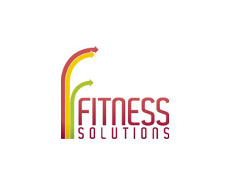
This was designed for a fitness instructor starting up her own business. The idea was to focus on the three aspects of the business (fitness training, sports massage therapy and nutritional advice). Rather than depicting these literally I've hinted at them using a different colour arrow to represent each and form the 'f' mark.
What d'ya reckon?
As seen on:
Status:
Nothing set
Viewed:
2213
Share:

Lets Discuss
I like it and especially the 3 coloured lines/arrows as you can take these and use them for different themes on websites with little icons to match. Well thought out.
ReplySweet
ReplyLate to comment as I just came across this... but I like it as is, especially the arrows. One thought to explore, however... if you try extending/curving the bottom of the green arrow down and to the left you could make a 'S' shape. All arrows may need adjusting, but the idea is that you could easily form both a *F* and a *S*.*Just a thought that seems to work in my head... may end up looking like crap, though.
ReplyCheers Rfrusso, nice suggestion. I'm afraid it's all approved and stationery is printed though so won't be able to change now!
ReplyPlease login/signup to make a comment, registration is easy