Description:
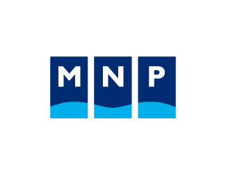
MNP ('Sea and Oil-and-Gas Projects') specializes in designing and building vessels and mechanisms for mining and transportation of oil and gas, with the primary focus being on the design of oil platforms. This served as the inspiration for the logo alluding to supports of an oil platform between which the initials of the company MNP are placed. To make this theme even more pronounced, a wave beats against the bottom parts of the 'supports', at the same time uniting the three rectangles into a single whole.
As seen on:
asgard-design.com
Status:
Client work
Viewed:
1817
Share:
Lets Discuss
It fits. Love the simplicity. Balanced well too. Love how you thought this through and developed the concept. It's great to hear how others work, especially when they make work as good as this. Nice job.
ReplyThere is TV channel that uses similarly styled logo - three side by side rectangles, holding a letter each (at the bottom I think). Can't remember which channel it is exactly, but it's one of the bigger ones here in Canada.
ReplyPlease login/signup to make a comment, registration is easy