Description:
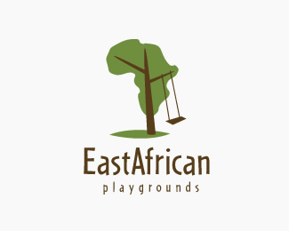
East African Playgrounds is a UK charity that aims to change the lives of children across East Africa by developing children’s learning opportunities and environments. They work alongside local communities to build stimulating and exciting playgrounds as well as developing long term employment and training opportunities for young people across East Africa.
As seen on:
East African Playgrounds
Status:
Client work
Viewed:
18619
Share:



Lets Discuss
Simple, I like it.
Replymaybe it will read better if East and African were separated?%0D*%0D*seems kind of heavy on the right side, would it balance out a little more if the swing was on the left?%0D*%0D*like your concept askSanik :)
ReplyReally clever mark incorporating the continent.**I do agree with gyui on the balance and possible separating East and Africa.
Replyi love it, but i do like it as one word. I am african and it always warms my heart to see wonderful things people of are doing for africa.
Replyreally nicely done*
ReplyThank you guys, really appreciate your comments and advices. David is right about the swing signifying east. I played with the swing to go to the other side and with the words East and African being separated but it just wouldn't look as good as it is now for me and the client. Thank you guys!
ReplyveRy vEry cReaTivE cOncePt!!!
ReplyThank you Talha!
Replyoh this logo is so apt...... the continent with the swing on the east side. Very clever design.
ReplyThanks everyone, you can see the full project description here:*http://asksanik.com/?p%3D1*
ReplyGood stuff!! Will look out for your client's work on the ground %3B-)
ReplyWow, this is the best logo I've seen in weeks.
ReplyThanks Lucas! :)
Replygreat work!
Replyexcelent
ReplyThanks guys! View more of this one here on my new website! : http://asksanik.com/work#branding
ReplyPlease login/signup to make a comment, registration is easy