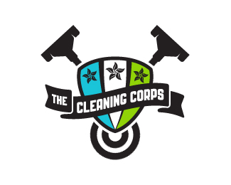
Description:
D.C. area cleaning and restoration service, specializing in carpets and upholstery. To compete with nationally-recognized industry veterans, client requested solid brand recognition through the depiction of strength and dependability. TCC was also interested in positioning itself as a pioneer in offering environmentally-friendly cleaning services, and to promote the philosophy of ethical practices and ideals. In this option, strength is communicated through the depiction of a triumphant crest. The crest has 3 panels and 3 military-style stars—representing the founders of the company—and the stars are built from leaves. The colors of the crest panels represent the Earth: Blue for water, White for clouds (air), and Green for earth. The leaves are a nod to the company's green practices. Behind the crest are 2 vacuum cleaner heads and hoses, and the hanging hoses at the bottom form 2 "Cs" rotated 90° CCW.
Status:
Unused proposal
Viewed:
4636
Share:


Lets Discuss
Nice Jon! im getting a bit of a soccer team vibe from this :)
ReplyThanks, Reno! And thanks for the floats, you guys! Heh, if any soccer teams approach me for a mark in the future, maybe I can repurpose this one in some aspect...
Reply%3BD - great idea!
ReplyAppreciate it, Bernd! Cheers!
Replythe only suggestion I have for this is to slightly increase the stroke that's dividing the colors underneath the flag. They seam to tapper off a little too much as they get towards the bottom. I enjoy this design very much. :)
ReplyThanks for the suggestion, comment, and float, Nash! Yeah, I probably won't be doing any more with this design as it was rejected by the client, but this is good feedback for any future marks I may create that use sectioned shields :)
ReplyPlease login/signup to make a comment, registration is easy