Description:
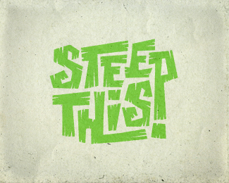
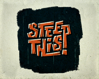
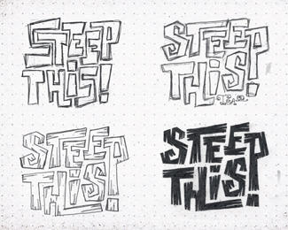
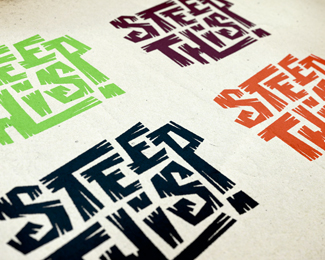
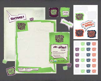
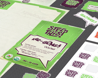
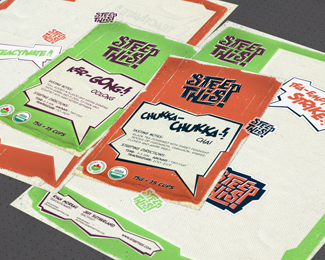
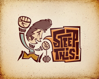
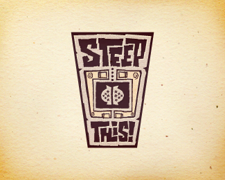
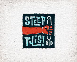
Logo proposal for start-up loose leaf tea company. The brand's values and messaging themes of freedom of choice & empowerment were heavily inspired by the U.S. civil rights movements of the '60s & '70s. Target audience: People who want to belong to a "tea scene" for like-minded individuals, but don't find themselves aligning with any of the current tea-drinking demographics, and are often dismayed by the negative stigmas surrounding tea. Tone: Should reflect the era, but avoid overly militaristic or psychedelic themes. Should portray boldness & strength, while still being fun, energetic, & youthful. Rationale: Client expressed affinity for '60s-era comic book art. This expressive, typographic exploration of the visual onomatopoeia of the company name was inspired by the dynamic visual sound effects found in vintage comic books, and uses heavily saturated colors and excitable phrases to incite action. Intentionally weather-beaten and made to look like it was printed on old, cheap newsprint. More info & images: http://bit.ly/dribbble-st02. Full case study: http://bit.ly/behance-st-case-study
As seen on:
Behance
Status:
Unused proposal
Viewed:
8167
Tags:
retro
•
old
•
vintage
•
halftone
Share:
Lets Discuss
wooww nice !
ReplyThanks for the compliment, Esapee!
ReplyAnd thanks David & Co. for the gallery spot!!
Great again. Is this the final design?
ReplyHey, Luma! Thanks for looking. Nope, this was one of three unused proposals. I'm making some minor tweaks to the chosen design, and will post on LP soon!
ReplyLove your presentation. top notch. I must say i lovee lino cut or woodcut. I'm a big fan of escher's work too and he's done some crazy woodcuts. But yeah your logo is going to look pretty sweet lino cut.
ReplyThanks, Abi! But the chosen concept (not this one) doesn't make use of lino/woodcut. Well, I suppose it *could*, but it's not an integral part of its design like the fist/infuser concept I have posted here on LP.
ReplyGreat concepts, all of them, JON!
Replylove your presentation on behance also. very informative and in depth rational.
good show!
top notch, jon. what a thorough and talented designer you are.
ReplyMikey & Colin, thanks buds! Appreciate all your kind words.
ReplyColin, beer needs to be in our future soon. What do we each have, like 2 months and a few days before our respective 'Big Days'? Need to make it happen before then, if at all possible.
Amazing Jon, I love it.
ReplyCheers, Rudy! Always welcome and value your feedback!
ReplyDunno about that red b*ll stuff but this certainly looks like it could give me wings!
ReplyDefinitely something Alfred should serve to Adam West. POW!
Great analysis and collateral Jon. Again!
Amazing project Jon, gold medal for sure!:)
ReplyLOL Norm! Thanks for your kind words. As always, I value your comments.
ReplyThanks for checking this out, Roko! I appreciate the compliment.
Very well executed! Love the look and feel. Well done! Awesome work!
ReplyHeyyyy Foster! Long time, man! Glad you like this one. Appreciate you taking a look.
ReplyGreat work!
ReplyFreaking great branding mate! Nothing more to say...
ReplyI am simply blown away. You know why :^)
ReplyJessica, Rich, Jovan, I sincerely appreciate the warm compliments. Thank you for taking the time to check this out :)
ReplyHey! i love your art! Im looking to get one made, if you would be interested please contact my email! ([email protected])
ReplyPlease login/signup to make a comment, registration is easy