Float
(Floaters:
24 )
Description:
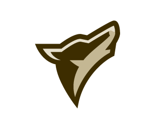
A coyote logo-mark I am working on. Typography to come.
Status:
Nothing set
Viewed:
8348
Share:




Lets Discuss
very nice mark!!!
ReplyAwesome, ...can't wait for the type either.
ReplyLove the simplicity!
Replyoh this is awesome!... it also kind of looks a bit like the state of Texas...??
ReplyWily coyote! Looking great, Bart.
ReplyAwesome indeed. Nice work.
ReplyI almost can listen to it!!! jajajaja AAAUUUUUUU!!!!! Nice work :D
ReplyKudos, Bart. This is very nice.
ReplyLove it.:) Kudos.
ReplyAwesome start. Looking forward to seeing the finished logo.
ReplyNice, nice, nice...:))) and super colors. Looking forward...
Replyme too. nice one
ReplyNice.
Replyvery nice
ReplyIt does indeed look very pretty. I am only afraid that it might be too close to the phoenix coyotes logo (http://www.sportslogos.net/logo.php?id%3D167)
ReplyThey're coyotes. They howl. Unfortunately, that's the only way to make your mark discernible from a wolf (even though the howl, too). And Bart's is a very graphic approach, though very much smoother looking. I don't think there's a conflict.
ReplyThanks everyone.**rpeschetz, I appreciate your concern but this is far from the BS brand that Phoenix is currently using.*
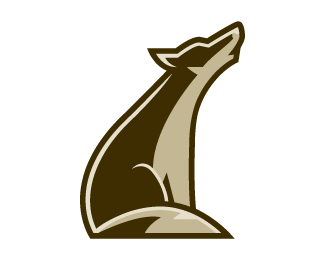
ReplyYou can see the full version %22here%22:http://logopond.com/gallery/detail/24214
ReplyI love this one! GREAT SHOWCASE! love your style!
ReplyPlease login/signup to make a comment, registration is easy