Description:
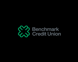
Previous concept for a local credit union. The mark is a letterform combination of B and M in a strong reliable shape.
Status:
Nothing set
Viewed:
1740
Share:



Lets Discuss
Bart, can also be seen as the %23 Pound sign as in numbers.
ReplyThe neg space also makes black Cs and Us. So you've got BMCU%23. Nice.
ReplyPlease login/signup to make a comment, registration is easy