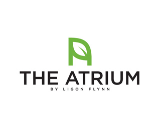
Description:
The Atrium is an inside courtyard for people to rent for weddings and events. it is very architectural mixed with nature.
As seen on:
www.atriumwilmington.com
Status:
Client work
Viewed:
10063
Tags:
•
tree
•
leaves
•
leaf
Share:

Lets Discuss
Very effective. Though I would personally reduce a bit the size of the type.
Replyclever and fitting.
ReplyGreat mark!*I agree with @Rokac.*The type is nice too, but I would remove %22the%22 or make it smaller if it has to be in the name.*Good luck!
ReplyThanks guys! I would remove %22the%22 but it has to be apart of the name. do you think it would throw it off balance if i make it smaller?
ReplyGreat execution of the idea.. :)
ReplyYou can type uppercase %22A%22 and in smallcaps %22TRIUM%22 and place %22THE%22 in smaller size smallcaps above %22TRIUM%22 right to the %22A%22.*I think that would keep it balanced.**The other thing you can try is just to push %22T%22 down and above it place %22THE%22.
ReplyThanks Balic! I will try that.
ReplyI would rather flip the A horizontally as it slightly unreadable as an %22A%22 this way.
ReplyPlease login/signup to make a comment, registration is easy