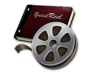
Description:
Not really a logo per se, but an icon for a Mac application. But it's kind of the logo too, for all intents and purposes.
REVISED: April 21 - All new textures and revised perspective and a lot more detail.
As seen on:
GuestReel
Status:
Client work
Viewed:
2136
Share:



Lets Discuss
nice illustrations.**there seems to be some perspective issues.*the trailing end needs work, it shouldn't bend down and get wider at the end.*inclusion of the open teeth holes will be nice to finish the film.
ReplyYou're right about the perspective issues, specifically the trailing end of the film...I usually do more cartoon style stuff so that kind of cartoony exaggerated end just seems to come out of me naturally...I do have a version for larger use with sprocket holes and frames though...
ReplyPlease login/signup to make a comment, registration is easy