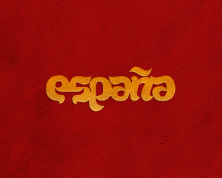
Float
(Floaters:
29 )
Description:
for fun lettering. Find a bull
Status:
Just for fun
Viewed:
2438
Share:



Lets Discuss
start here http://logopond.com/gallery/detail/119530
ReplyI like it!
ReplyThanks for you comment mate and upd colors..
ReplyStyle! font is draw?
Reply%5EYes :) thanks
ReplyThat is awesome type logo! I found bull, too. I love these minimalistic clever ideas. Great colors, too.
Replylovely :)
ReplyThis is great. And works better than abbrevation, probably because of the thing over %22n%22 that gives more balance to the whole image because it is cofronted to the %22p%22 if you know what I meen. Speaking of %22n%22 I think that it needs some more tweaking, it looks crooked a bit.*Otherwise, wonderfoul type treatment, deserves the gallery spot.
ReplyMany thanks to all guys!*@hyperborea: I did a %22n%22 so intentionally (talk about a certain curvature). The fact that the entire logo is made up of emotions and the game. Coincided, so that %22n%22 is between two identical letters %22a%22. If I do this without any slope - it just may be lost. I would not want to :)
Replyvery nice Ivan.
ReplyThank you Paul :)
ReplyThanks Alen. If I understand what you mean. You want to see it the main signal (the bull), but in my opinion, a little cover-up that it does its job. This logo does not live only for the bull, it has its own character and structure. And the bull - a little bonus to those who want to give the logo a bit of time. The short version is just built for the bull :)
ReplyOl%E9!!
Reply%5E hah yeah!!
ReplyAwesome use of negative space. Love it!!
ReplySounds very good and it pleases! :)
Replyvery cool, great work :)
Replynice and fun. hidden joy. :)
Replyfedex bull : )
ReplyThanks my friends!
ReplyMaybe someone wants a t-shirt with it :) Link %3Ca href%3Dhttp://cl.ly/bcb1eda5056e0112fce6%3Ehttp://cl.ly/bcb1eda5056e0112fce6%3C/a%3E (*. eps)
Replybravo
Replythank you Ashley
ReplyPlease login/signup to make a comment, registration is easy