Description:
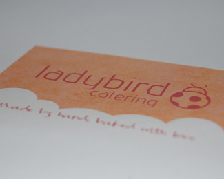
I've been having a lot of difficulty fitting the large amount of type into this logo. Here is one solution. Would love to hear your thoughts.
Status:
Unused proposal
Viewed:
2049
Share:


Lets Discuss
thanks Alen! I can always rely on you for feedback...really appreciate it man!
ReplyI've updated the type on this one, I think it looks a lot better..what do you guys think?
ReplyPlease login/signup to make a comment, registration is easy