Float
(Floaters:
19 )
Description:
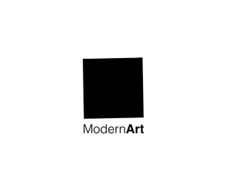
Logo created for modern art exhibition
Status:
Client work
Viewed:
2589
Share:
Lets Discuss
Great idea
ReplySo simple, looking cool %3D%5D
ReplySerb1an, mr. white, chaos_fx**thanks
Replyyes it is... modern art %3B)
Replynice work, cheers mate
ReplyVery nice, but the frame .. the frame ruins the minimalism :)*
Replyepsilon, maybe...I'll try to make it simple
ReplyWhy is the square crooked?
Replycoz its modern art %3B)
Replylast night i was thinking about something abstract like this, if i'll do it i'll post it. anyhow the concept is very good.
Replygood one
ReplyWoah, the tilt is an ingenious touch
ReplyThanks guys
Replyart is way over the black square! nice logo though %3D)
ReplyJust ran into %22this%22:http://tv.expert.ru . Yours is clearly better, but with a concept as simple as this the collisions were bound to happen.
ReplyI love it! 'simplicity is the height of sophistication' -da vinci
ReplyPlease login/signup to make a comment, registration is easy