Description:
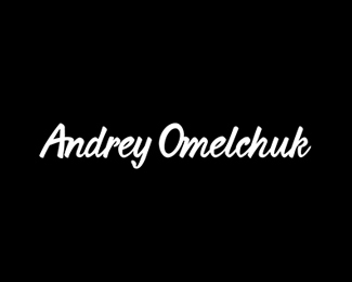
One of the first projects. A logo concept made by lots of customizations in a Kaushan Script font. Absolutely digital work.
Status:
Client work
Viewed:
1655
Tags:
•
font
•
script
•
lettering
Share:


Lets Discuss
Ah, a fellow Russian speaker.
ReplyI like the font customizations, it seems though that some letters are farther away from its buddy then other letters, and it makes it look a bit messy in that way. For example the kerning between E and L is in Omelchuk is less then H and U, and O and M are really close together. In my feedbacks defense I am trying to look at it from a critique point of you, aka neat-picking a bit. See you around. Thank you for your feedback on my work!
Thank you too, I'll play with tweaking that stuff!
ReplyPlease login/signup to make a comment, registration is easy