
Float
(Floaters:
0 )
Description:
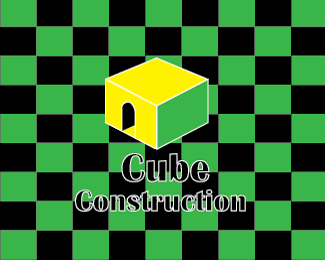
This is a logo that is done for my class, we had to create a logo from our sketches and I have always enjoyed making 3D sketches. So I decided to make a logo based off a 3D cube and make it seem that when a person looks at see that each piece on the back ground is a cube and the building is a cube.
Status:
Student work
Viewed:
947
Tags:
Cube
Share:


Lets Discuss
i do like it but i think id fill in your lettering with the white so we can read it or change it some how so we know what its saying. i do like how before you click on the picture it has a cool effect of depth by having that checkerboard background. and i know people are really against gradient but if you could make it work i think it would look cool if you put a gradient on your cube
ReplyI'm sorry but I don't like it. There is to much going on that it makes my head hurt. I would suggest of getting rid of the background and just do a solid background with the letters filled in. I like the font and I think that you could get away with just that without the cubed house. But if you keep the house I would put it to the side or even underneath the company name.
ReplyPlease login/signup to make a comment, registration is easy