Description:
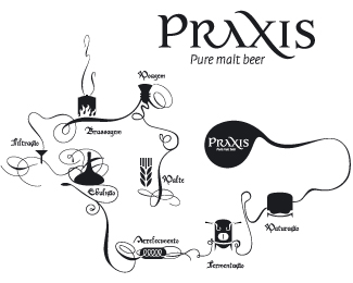
Praxis is a new beer that will be produced and sold in a bar in Coimbra. The client wanted an Identity that would immediatly point to Coimbra and its traditions (Coimbra is a very important university city), and the solution of simply using the plain black associated with city’s student community was highly effective.
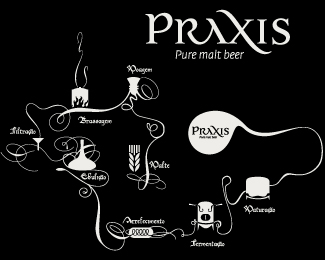
The logo itself is a typographical flowsheet of the process of beer production held by the production unit, giving the modern/medieval look the client was looking for.
Status:
Nothing set
Viewed:
3590
Share:


Lets Discuss
This isn't a logo, it's a diagram. The word %22PRAXIS%22 is a logo, but this in it's entirety is not. A logo is something that should be immediately recognizable to the viewer. It needs to convey a message in a split second as sometimes that's all the time the viewer has to offer. You're asking the viewer to hang out for a while and follow a meandering visual path with a ton of minute details. Good luck!
ReplyYou should try to convince your client that this is too much detail. the graphic elements are nice, but too much for a brand logo. have you thought of incorporating some of the processes of the beer production into the word PRAXIS? What about the wheat image as the letter %22i%22 in %22Praxis%22. just an idea. even if they are out of order. besides, who wants to give away the secrets to your formula. **good luck. clients aways become art directors with me too.
ReplyUntil I read your description, I was sure it was the logo, in the upper right, accompanied by a separate diagram. This is the entire logo? It's a little crazy and, as the other two have said, it is not a logo. A logo can be shrunk down to be printed on a pen or golf ball and still be recognizable. Or, in the opposite sense, be blown up to the size of a building and be easily recognizable. That diagram won't work in either case. Shoot, I would bet poster size is the only size it can ever work in decently.
ReplyPlease login/signup to make a comment, registration is easy