Description:
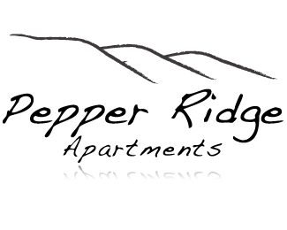
I left out the pepper and went more with the ridge idea. I'm not happy with the font I used, and plan continuing to rework this logo. Anyone have a suggestion on a different font?
Status:
Unused proposal
Viewed:
670
Share:
![KRUB [fm]](/logos/36ad8dd2130e77e9d8f4c2c3bd5d1fcc.png)

Lets Discuss
I thinki you could work a pepper into the ridge by slightly curling the bottom part in middle with nice cleaner lines and use just about any Other font than the one chosen.
ReplyYeah, the font is terrible. And for the love of God please don't use the reflection technique on the type! It only detracts from the logo.**As for the font choice, there's a lot of factors you need to consider - the overall architectural style of the apartment complex, the vibe of the town it's located in, the look and feel of the surrounding area, etc. If the complex is in the style of old west architecture and you create an ultra modern sans-serif logo for it then the styles may not mesh. You know the client and the complex better than we do. Take a look at some of the other logos on this site for font inspiration.
ReplyPlease login/signup to make a comment, registration is easy