Description:
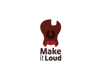
Logo for Music studio
Status:
Work in progress
Viewed:
704
Tags:
canvaske aske design logo
Share:


Lets Discuss
Love the idea here.. wondering about that top tooth? would it make more sense not to have it? You could also potentially get rid of the tongue, and imply that the bottom white area is the tongue.. it'd simplify it a bit.. just my thoughts.. really cool either way!
ReplyI love the concept here: it's both an open mouth and a guitar body. However, the guitar is upside-down, and also, with no fret board, some people may not get it. And as Danny pointed out, the top tooth is a little wonky.**Might I suggest this:**I think your shape could still survive as an open mouth - and be more guitar-like - if you flipped it vertically. Keep the uvula and tongue where they are (obviously), but flip the guitar body and bottom row of teeth. Then, set your type in a very thick, black, squared typeface, all-caps, and run it vertically stemming from the negative space created from the top row of teeth. The type would create the fret board. You could even get creative with your type and try to create tuning knobs out of some of the letters near the top.**Does any of that make sense? Sorry, I'm still waking up...
ReplyPlease login/signup to make a comment, registration is easy