Float
(Floaters:
19 )
Description:
Another version of a concept I have been working on.
Status:
Just for fun
Viewed:
3957
Share:


Lets Discuss
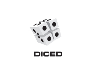
Nice cerise, I'm liking it a lot more. this may seem really picky, but now the dice is julienned (matchstick cuts) :P
ReplyI'm liking this one cerise! very nice :)
ReplyThanks Jen and gyui. I have a third one on it's way.
ReplyWow George I'm impressed with your culinary skills :%5D
Replyi think i watch too much food network! :P
ReplyWhy does anything need to be sliced?
Replyi like this... clever %26 creative.. nice cerise...
Reply@ Paul Rand Good Point yet again. %0D*@ Nido Thanks
ReplyWOOOOOOOW ,ERES UN MAESTRO !!!%0D*MUY BUEN PORTAFOLIO
Replythis is cool Cerise.
ReplyCheers guys
Replyvery cool. I like both versions
ReplyThanks a lot Rich
ReplyOooh yeah - I like this one too.
ReplyThis is really nicely crafted. Sliced, diced- they mean the same thing to me if you look at them in this logo....and that thing is awesome.
ReplyThanks a lot Chad
ReplyGreat execution, very good!
ReplyThanks Milos
ReplyVery cool concept!
ReplyThanks Alenami
ReplyGreat concept! But let me make one small remark. Letter E looks a little bit hard and squeezed. If you make the average horizontal element in this letter a little shorter, the whole inscription will looks much better.**There is no limit to perfection!**%3B-)
ReplyThanks Petro, your right that E might need a tweak
ReplyPlease login/signup to make a comment, registration is easy