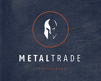
Description:
I made that logo, for a steel exporter company. I wanted to illustrate, that they are strong, and brave on the market.
Status:
Nothing set
Viewed:
6127
Share:

Lets Discuss
clashmore: i was very cheerless when i have read your post... I've never seen that iron black logo before. My concept was that they are very agressive on the market, and the make shiny metal, steel stuff from the black raw material ( thatswhy i've used reflections)
Replyahhh come on! clash, when you take a widely used graphic ( %22see here%22:http://www.istockphoto.com/file_closeup/arts/art_styles/ancient/2653146_ancient_greek_corinthian_helmet.php?id%3D2653146 ) and turn it into a logomark, you can't point to the similarities when someone else uses it. This version has a different spin taking the negative space to use as shading. Both are great marks. chek, don't become cheerless, this is a great mark! good job!*
Replythanks guys:)
Replyvery nice mark :) nicely portrayed ....
Replythanks kaimere :)
ReplyStupendous mark! :)
ReplyPlease login/signup to make a comment, registration is easy