Description:
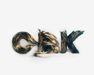
This is a logo made of hair, for the spanish advertising agency Chickenbrainken.
Status:
Client work
Viewed:
11746
Tags:
artesanal logo
•
alternative logo
•
Chickenbrainken
•
Hair logo
Share:
Lets Discuss
Nice!!
ReplyThank you!! :)
ReplyThis logo looks weird, scary and disturbing, BUT! it works perfectly in my opinion, well done. Memorable.
Replyhaha Thank you Rudy! we are weird and disturbing people in the agency haha :-)*Thanks again!
Replywoow
Replydefinitely caught my eye
Reply%3B) Thank you! Our hair is very happy today!
ReplyI'm amazed how legible that B is :)
ReplyC is the sweet letter, B is the heavy metal , and K is the %22it%B4s all ok, just relax...%22 haha :)
Replylooks cool, im just nervous that its not a vector. lol.
Replygood
ReplyYes! Perfect work!
ReplySo how the vectors look like?
ReplyNot being a hater here but I had real difficulty reading the %22B%22 the swishing lines that penetrate through the letter make it appear to be more of an %22R%22 shape.
ReplyA little strange but the idea works
ReplyHey! thanks for all the comments! We have the logo with vectors, it%B4s look really cool (in our opinion), Jorge, our designer, has done a nice work in digital. *We let you know about it when we have it online. :)**Thanks!
Reply%5E So you can show the vector version to us? %3B)
ReplyYeah, of course! we will post the digital logo, Jorge is retouching a few hairs %3B)
Replya reproduction nightmare to get cmyk consistently right.
Replyxyz)
ReplyAs others have said very strange. I'm not sure if I personally like it, but I'd be interested to see the vectored version as this doesn't really feel like a mark. It feels more like a piece of work.
Replyvery interesting. nice to see something unique on the front page. my only critique is that i couldn't see the B. the top fringe is too long, disguising it a bit. can't wait to see the vector.
Reply%5E I meant to say 'this unique'. there's plenty of unique stuff floating around. this is just super different
Replythe vector would be way different looking, unless you're going to gradient mesh it for the rest of your life. a cool direction to take on logo marks although it doesnt really accomplish the point of what true mark design are intended to accomplish.
ReplyNice one
Replygood job
ReplyCrazy and unique!
ReplyNot sure whether to be disturbed or inspired. Think I'll go with the latter! %3B)
ReplyThis is really cool...
Replyhttp://www.youtube.com/watch?v=QMmyw-YpbEk
Muy buena idea chicos. Los felicito.
Please login/signup to make a comment, registration is easy