Description:
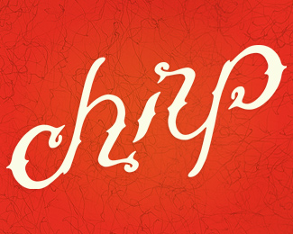
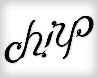
I had an idea to execute my freelance logo in a different style. My goal was to finish and upload before becoming a father (x3). I was successful with that. :)
This is my latest attempt at a script ambigram. Comments appreciated, and thanks for looking.
As seen on:
behance
Status:
Client work
Viewed:
2364
Share:
Lets Discuss
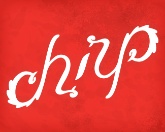
Hey Todd! Man, this has got some serious style on it! :)**Don't know if I missing the 'feathery' bits on the ends too much? They definitely add a ton of character to the mix...%3Cbr%3EBut in any case, I've always loved the core of this lettering! Excellent work!
ReplyFrankly, i%60ve just now noticed it%60s an ambigram. Very nice. I%60d like to see smaller and on a clean bg. :)
Replysee it* smaller
ReplyAlways liked seeing this one. Cool ambi!
Replyreal sweet ambigram, Todd. very cool!*
ReplyThanks for the comments, much appreciated.**@ Michael: Losing the feathers was my internal debate. But in doing so, I feel I gained a little beak-ness.**@ Srdjan: I'll upload a one-color on a neutral bgnd.
ReplyNice one! Reducing it for presentation would help.
ReplyWow, kewl! Awesome job, chirp!
ReplyAwesome!
ReplyThank you!
Reply...looks great :)
ReplyPlease login/signup to make a comment, registration is easy